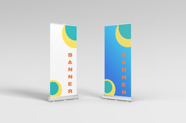
Selecting the perfect colour palette for your roller banner is crucial to attracting attention and conveying your message effectively. The science of colour psychology and thoughtful consideration of your target audience and branding play significant roles in this process. Additionally, factors such as contrast, legibility, mood, emotion, colour symbolism, and gathering feedback through testing are essential considerations. This article will focus on the science of colour and provide practical guidance to help you create an impactful roller or pull up banner.
Table of Contents
The Psychology of Colour
Colour psychology studies the impact of colours on human behaviour and emotions. Different colours elicit varying psychological responses. For instance, warm colours like red and orange are often associated with excitement and energy, while cool colours like blue and green evoke calmness and relaxation. Understanding these associations can help you choose colours that align with your banner’s purpose.
Consider Your Target Audience
To make a strong visual impact, it’s essential to consider your target customer when selecting a colour palette. Different demographics and cultures may have varying preferences and interpretations of colours. For example, while red may symbolise luck and prosperity in some cultures, it can signify danger or urgency in others. You can make informed decisions about your colour choices by researching your target audience’s preferences and cultural backgrounds.
Branding and Consistency
Your roller banner should align with your brand identity. Consistency in colour usage helps create a cohesive brand image across different marketing materials. Consider incorporating your brand’s primary or logo colours into the banner design. This consistency helps strengthen brand recognition and reinforces your message to the audience.
Contrast and Legibility
Legibility is crucial for an effective pull up banner. Optimal contrast between the background colour and text ensures the message is easily read from a distance. Dark colour text on a light background or vice versa provides better legibility. Additionally, consider the colours of images or graphics on the banner to ensure they stand out and complement the overall design.
Mood and Emotion
Colours have the power to evoke specific moods and emotions. For example, a vibrant and energetic colour palette can create excitement and enthusiasm, which may be suitable for promoting a sale or event. In contrast, a more subdued and calming palette can be appropriate for conveying a sense of professionalism or tranquillity. Consider the emotional response you want to elicit from your audience and choose colours accordingly.
Colour Symbolism
Colours often carry symbolic meanings that can influence how your banner is perceived. For instance, when aiming for environmentally friendly campaigns, incorporating green into your colour palette can evoke a sense of nature and freshness. Similarly, businesses in the finance or healthcare industry can benefit from using blue, which is often associated with trust and reliability. Understanding the symbolic meanings of colours can help you align your banner with the intended message and purpose.
Testing and Feedback
Before finalising your colour palette, testing your design and gathering feedback is crucial. Share your roller banner mock-ups with colleagues, friends, or potential customers and ask for their opinions. Consider their input regarding the colours used and how they perceive the message. Testing and feedback can provide valuable insights and help refine your colour choices for maximum impact.
Conclusion
Choosing the right colour palette for your pull up banner is a strategic decision that requires careful consideration. By understanding the principles of colour psychology, considering your target audience, maintaining branding consistency, ensuring contrast and legibility, evoking the desired mood and emotion, leveraging colour symbolism, and seeking testing and feedback, you can create a visually attractive and effective retractable banner that effectively communicates your message. Remember, colours can captivate, engage, and leave a lasting impression on your audience. So, take the time to explore the science of colour and apply it to your roller banner design to ensure it stands out, communicates your message clearly, and positively impacts viewers.

